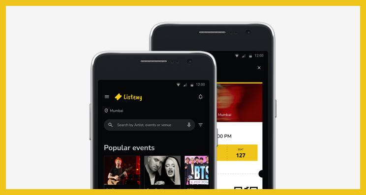
Listeny's App
Design a Concert Ticketing App for a trendy musicians to book the ticket on the app itself easily.
My Role
UI/UX design and Design System
Tools
Figma & Adobe Photoshop
My Responsibilities
Conducting interviews, paper and digital wireframing, low and high-fidelity prototyping, visual designing, conducting usability studies, accounting for accessibility, and iterating on designs.
Duration
Around 4 months
Overview
Listeny’s concert ticketing app is where you can book the ticket for your favourite music concert. It can be in your local area or global area. Listeny strives to make the ticket available hassle free online. Listeny targets local and global customers and is searchable by locally and globally who loves to attend musical concert out of their mundane lives.
Problem Statement
Busy people like office workers or students who wants to enjoy their favourite music concert are not able to book the ticket online without third party.
The Goal
Design an app for Listeny’s concert ticketing that allows users to book the ticket on the app itself easily.
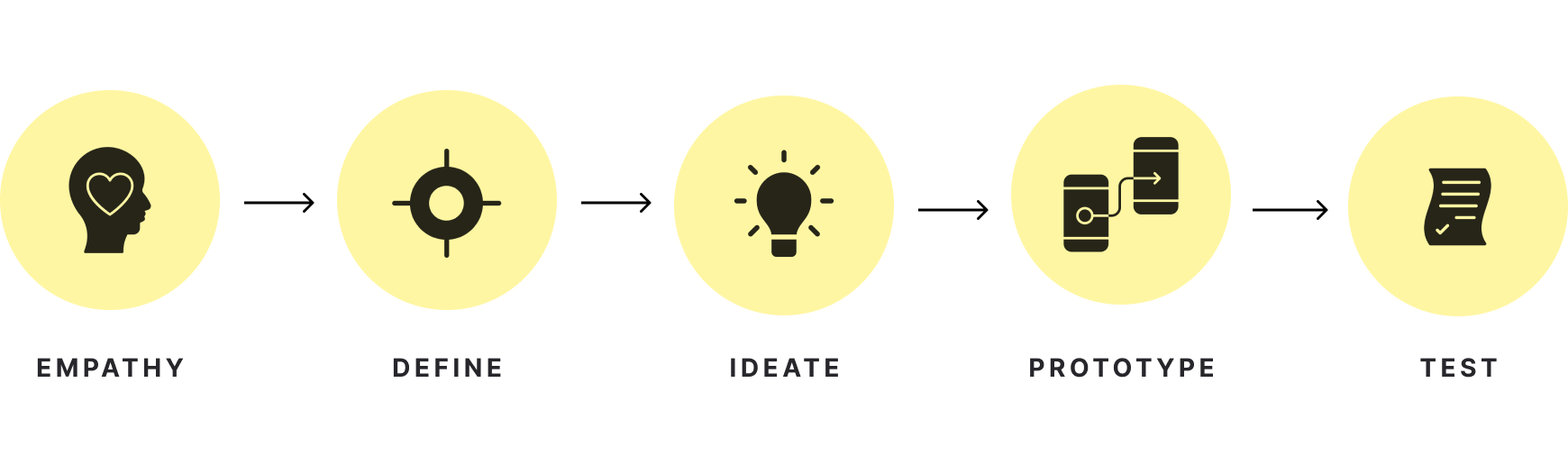
Framework
I have chosen the below framework:
Understanding the User
1/3 User research: summary
I did surveys. Also I conducted five interviews and created empathy maps to understand the users I’m designing for and their needs. A primary user group identified through research was working adults and students who wants to enjoy who wants to enjoy their favourite music concert and are not able to book the ticket online without third party.
This research revealed that it’s frustrating to go to the third party to book the ticket for their favourite music concert. Other user problems included checking the seat position, finding nearby music concert, or very lengthy process to book the ticket
Here are the three pain points:
Book through third party
Working adults and students are frustrated to book the ticket through third party.
Sold out tickets
Don’t know which ticket is available and which one is sold out.
Seat position
The stage line arrangements for every class are unclear.
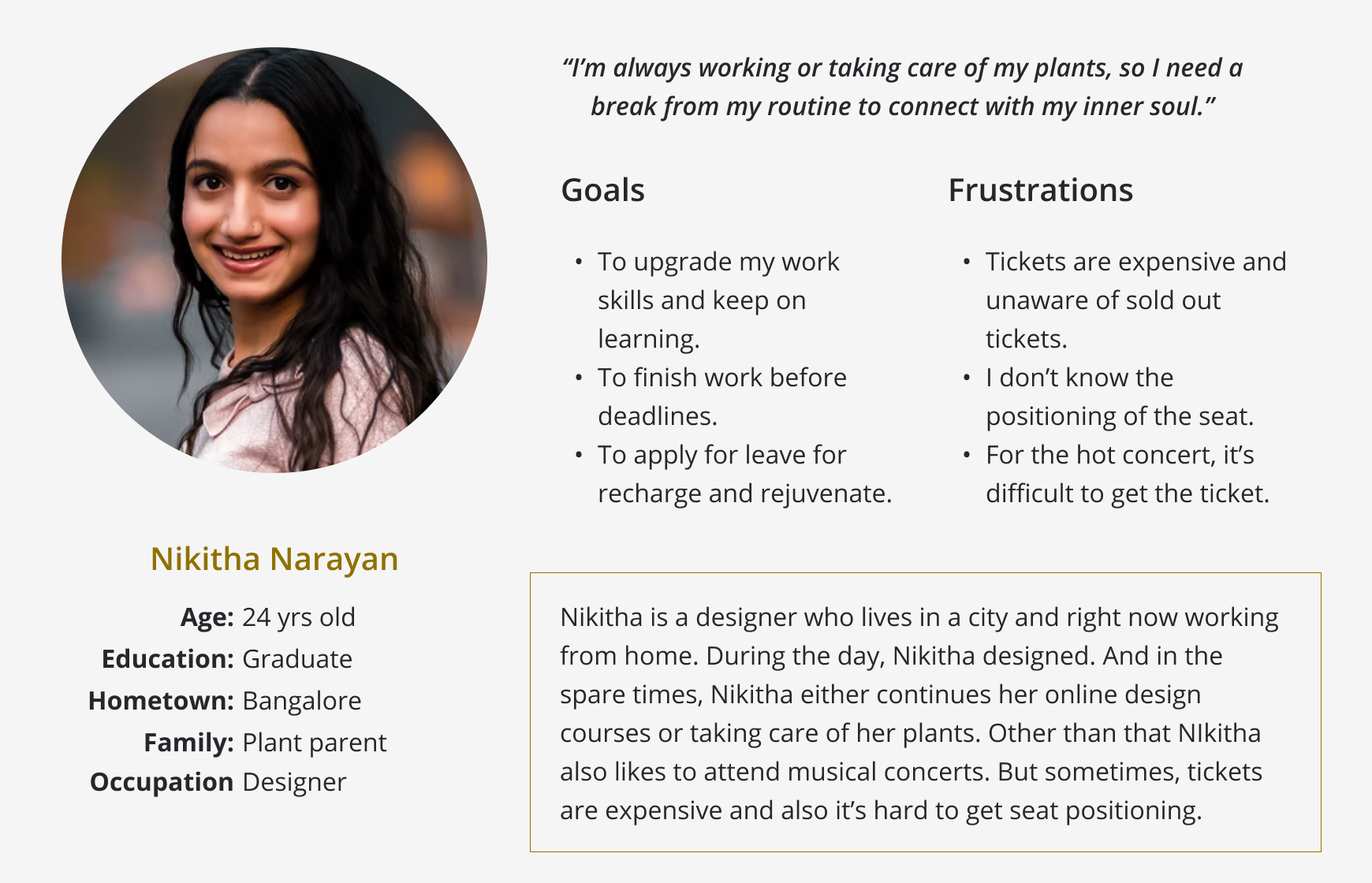
2/3 Persona
Problem statement of Nikita Narayan:
Out of two personas, I have chosenn Nikitha's persona for this user journey. She is a busy 'work from home' designer who needs to take time off to recharge and rejuvenate because she needs a break from her daily routine to connect with her inner soul.
And here is her persona:
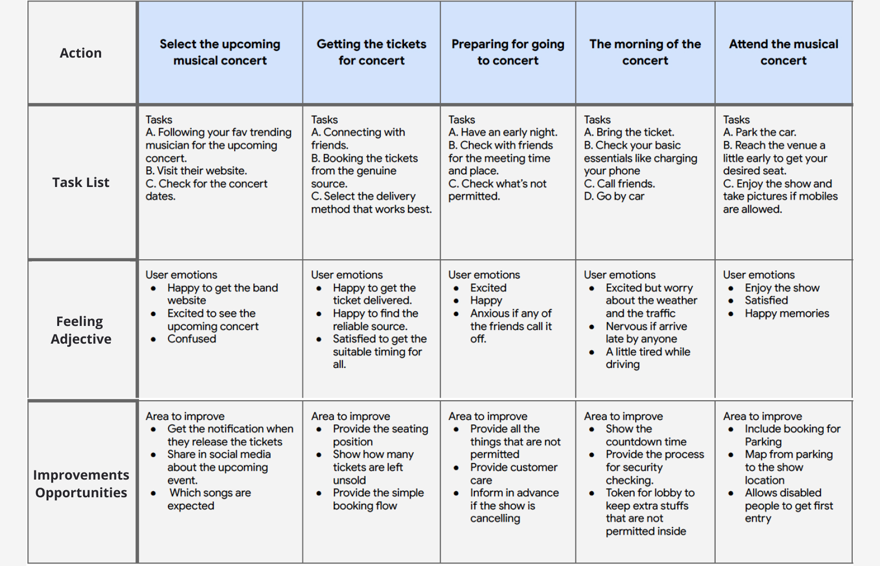
3/3 User journey map
Mapping Nikita’s user journey revealed how helpful it would be for users to have access to book a ticket on a Listeny’s concert ticketing app.
Persona: Nikitha Narayan
Goal: To attend the musical concert with her friends.
Starting the design
1/4 Paper wireframes
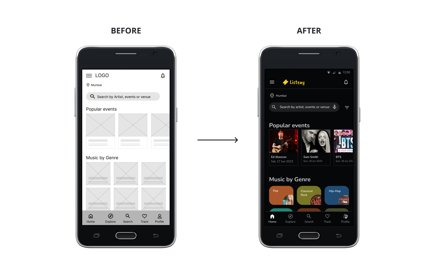
Taking the time to draft iterations of each screen of the app on paper ensured that the elements that made it to digital wireframes would be well-suited to address user pain points. For the home screen, I prioritized a quick to search the musician or events and easy booking process to help users save time.
2/4 Digital wireframes
As the initial design phase continued, I made sure to make it easy for the user to search faster after feedback and findings from the user research.
Easy to search their seat position is a key user need to address in the design and also keeping the artist’s details, and date, time and venue informations upfront.
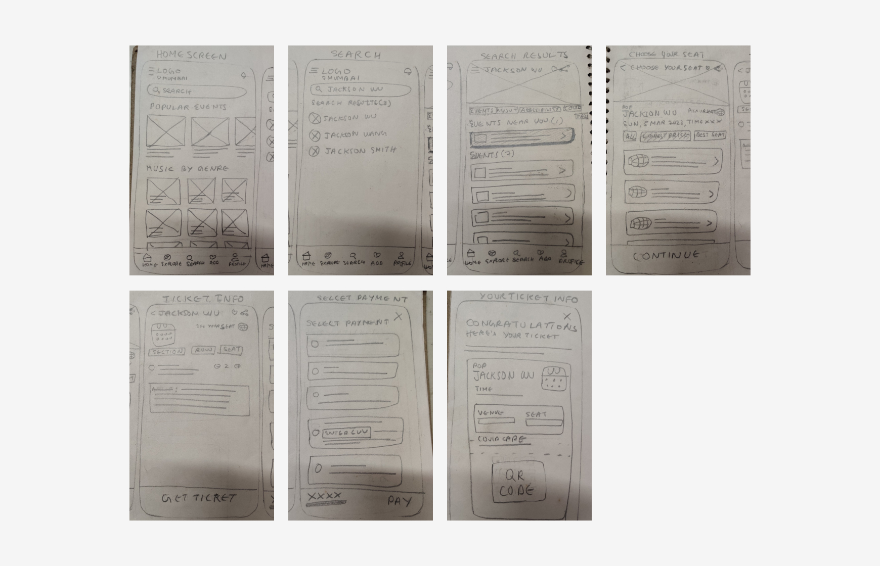
3/4 Low-fidelity prototype
Using the completed set of digital wireframes, I created a low-fidelity prototype. The primary user flow I connected was building and booking a concert ticket easily, so the prototype could be used in a usability study.
Here is the low-fidelity prototype:
4/4 Usability study: findings
I conducted two rounds of usability studies. Findings from the first study helped guide the designs from wireframes to mockups. The second study used a high-fidelity prototype and revealed what aspects of the mockups needed refining.
Round 1 findings
1. Users wants to quickly search like adding search by voice
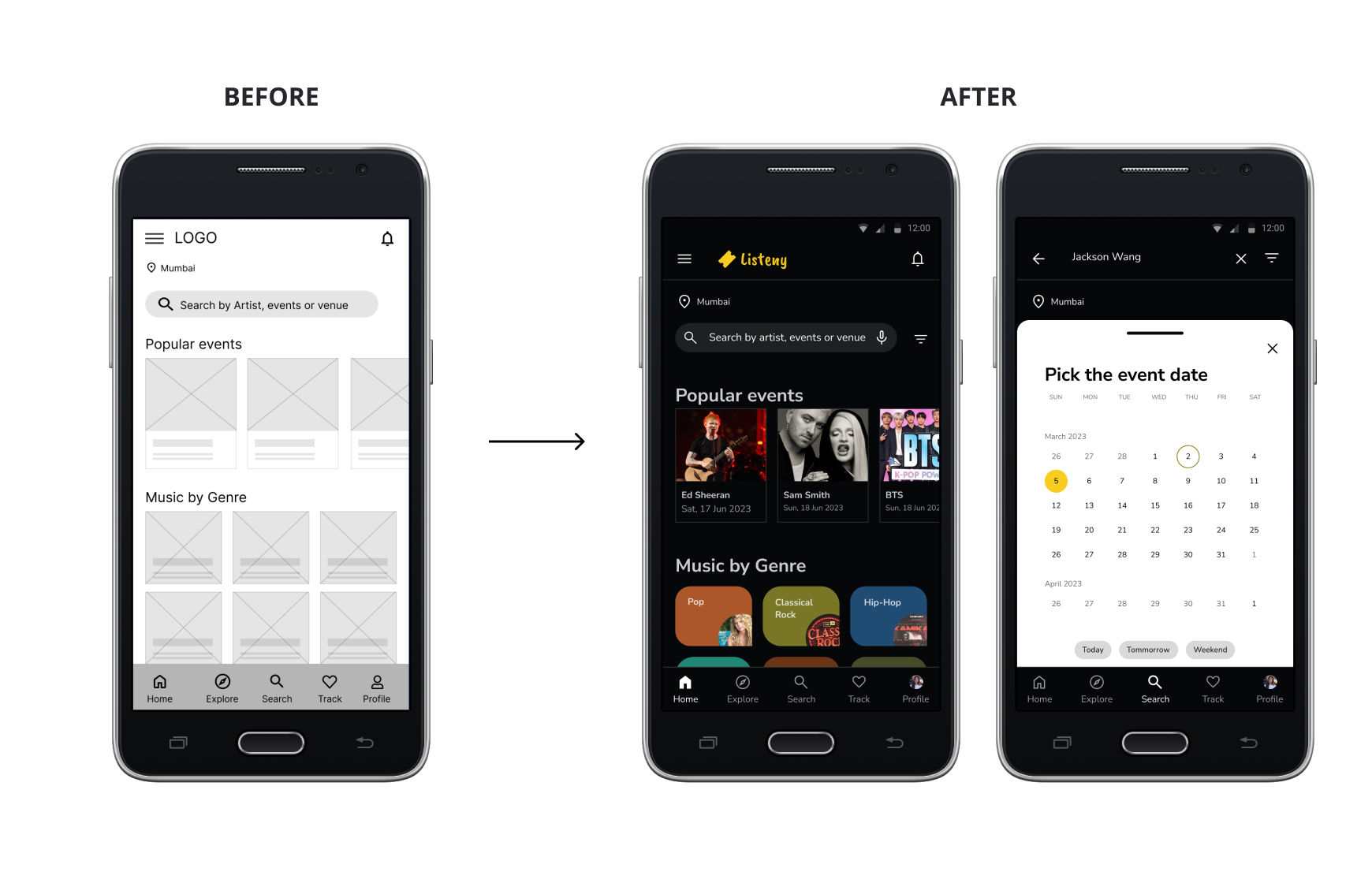
2. Users wants to have date picker options while searching
3. Users wants to have the search on top in search results screen
Round 2 findings
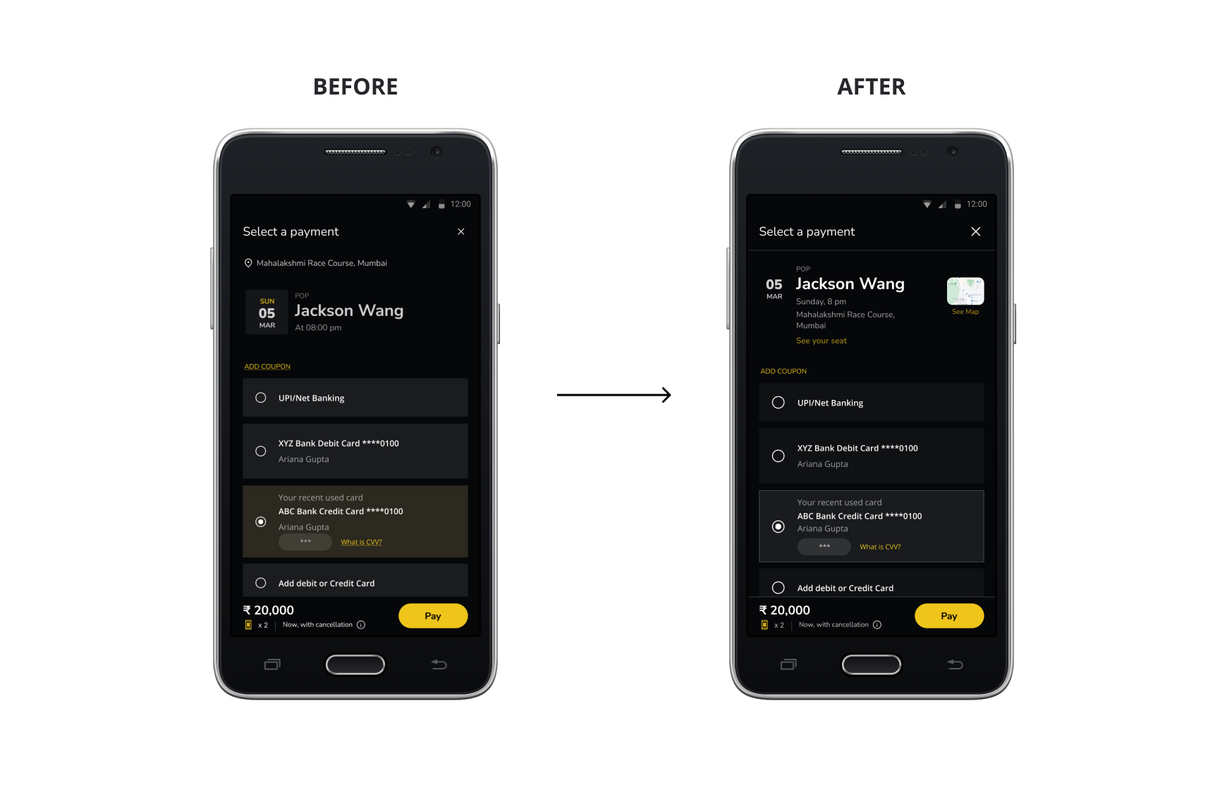
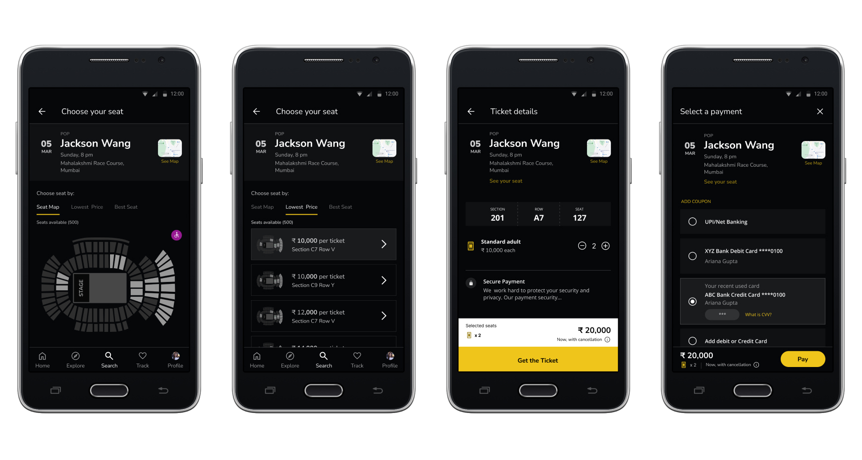
1. In ticket details screen, users wants to see the venue details with all other details in group and able to go back and see the seat position from payment screen
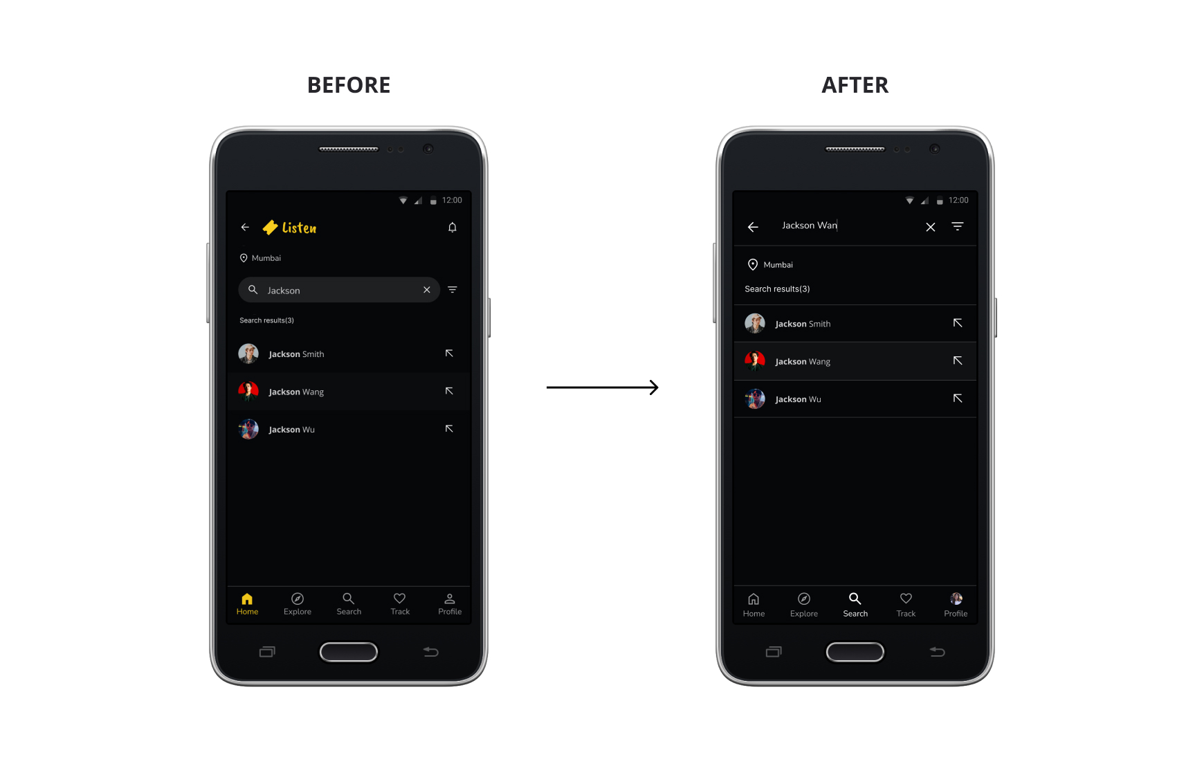
2. User wants to have the search on top while searching as well instead of title
Refining the design
1/3 Mockups
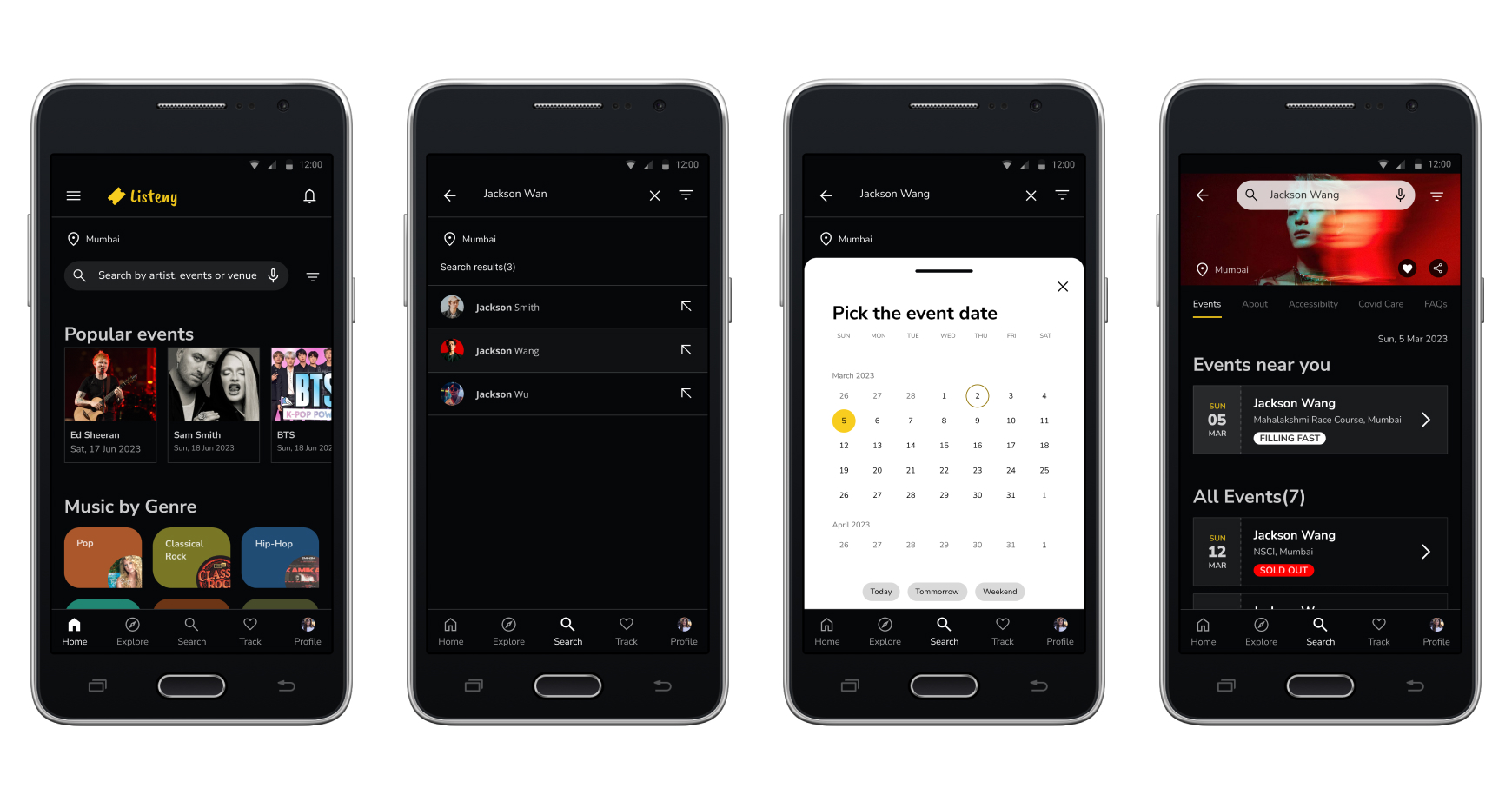
Early designs have search by type only, but after the usability studies, I added additional options search by voice so that users can have more option to search.
After the usability studies, I added the filter to search by date picker. From the filters, the date picker screen slides in and users can select their desired date options while searching.
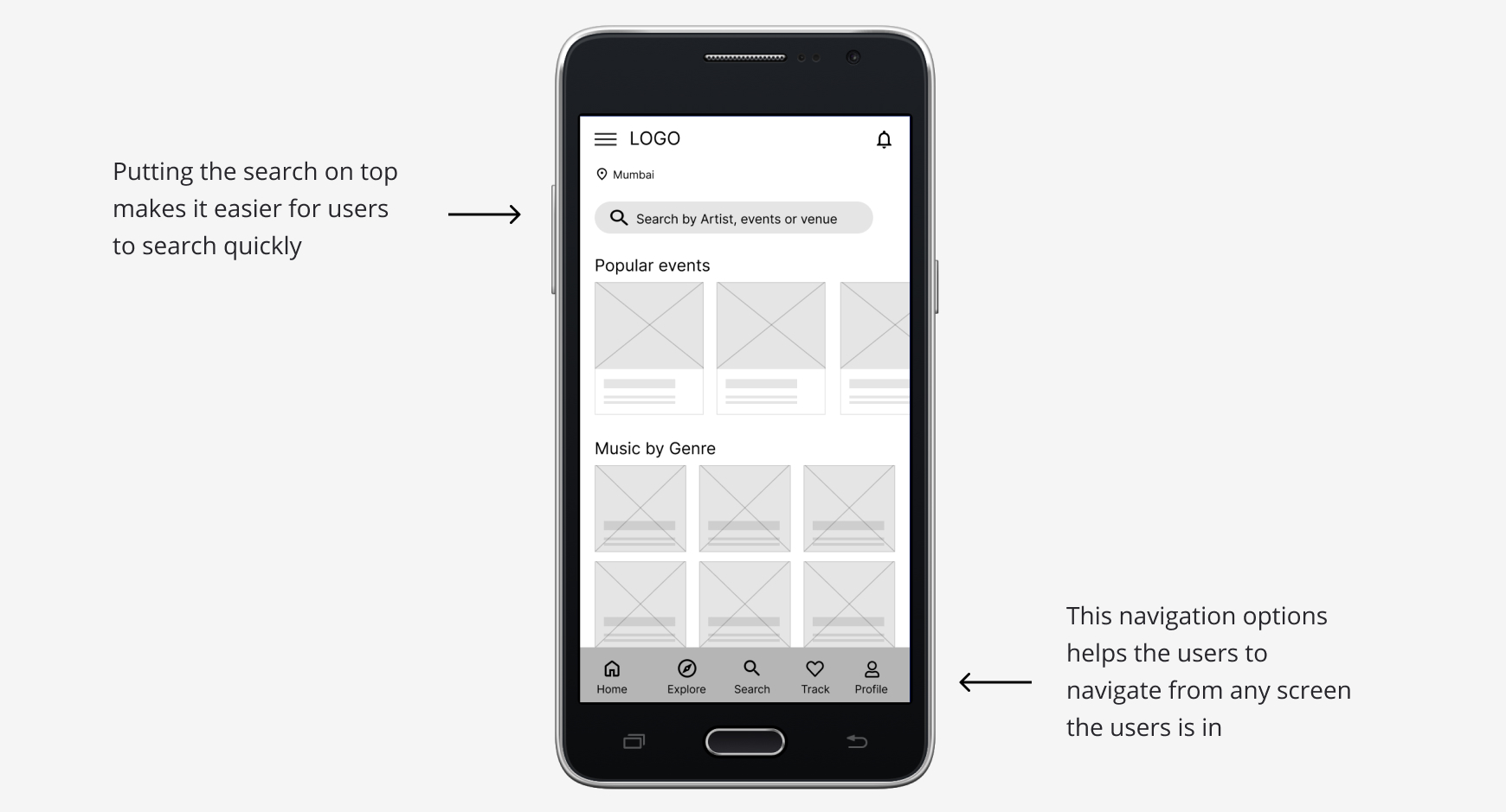
Again after the usability studies, I added search on top instead of having title so that the users can search another artist or events without going back to the previous screen.
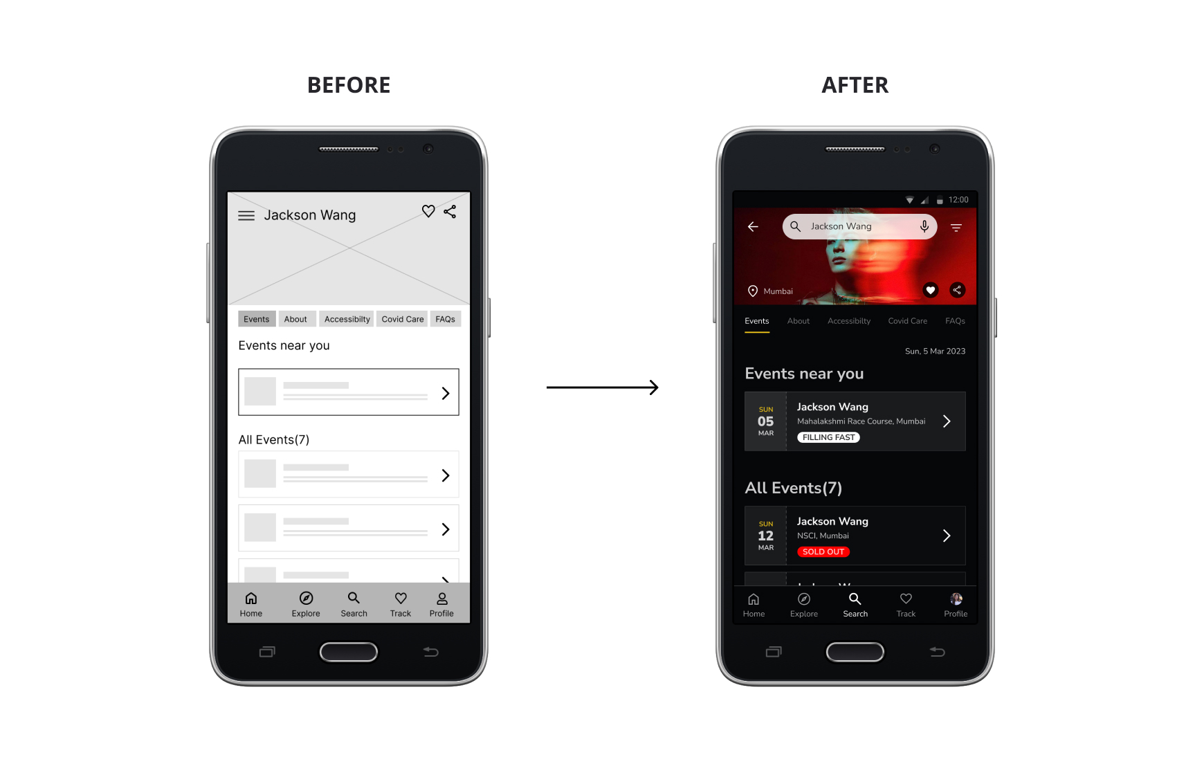
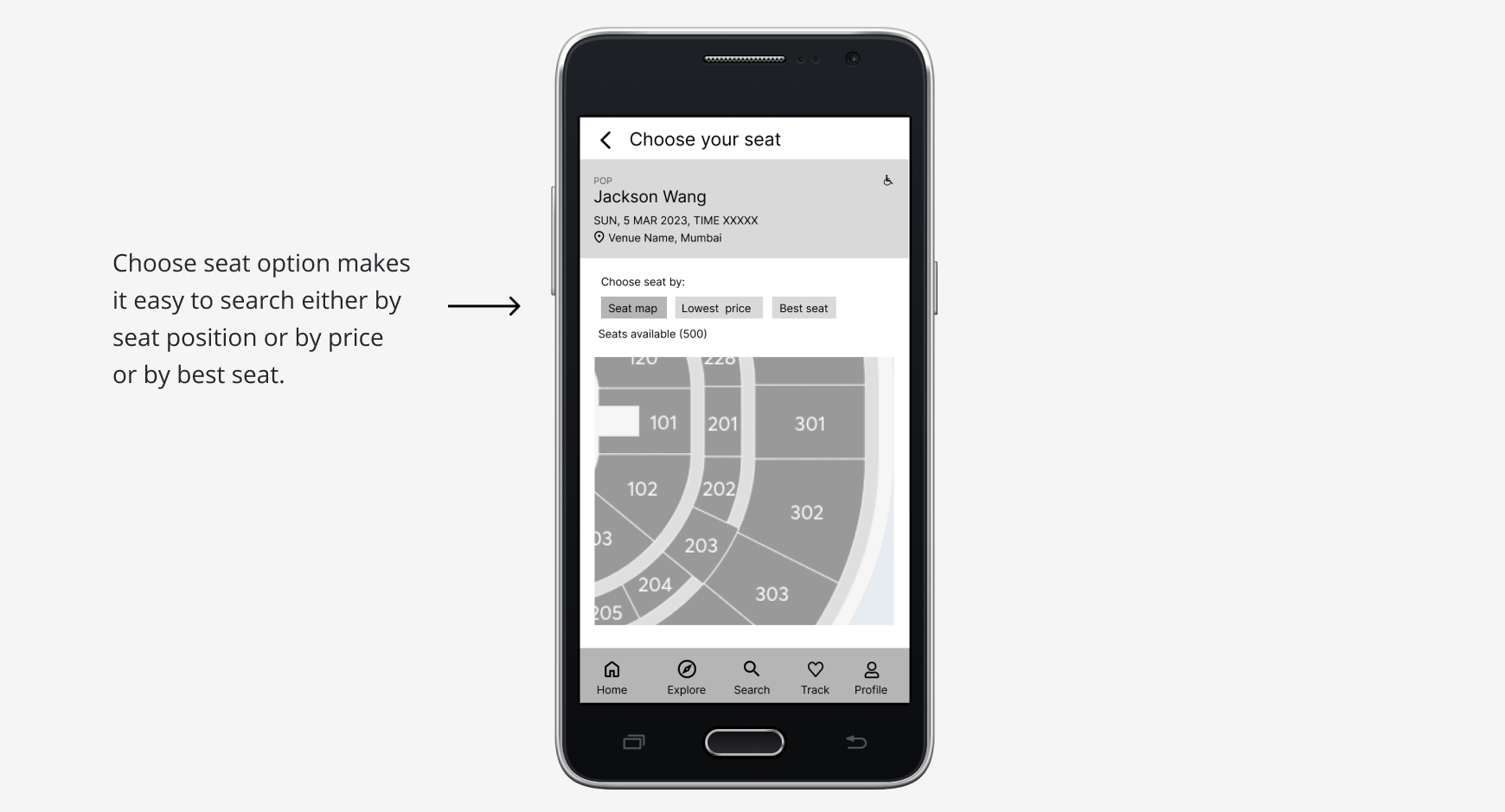
The second usability study revealed frustration with the events details and venue details separately. To streamline, I grouped all the event details and venue details in one place. Also, I added venue map and the link to check the seat locations.
The second usability study also revealed that putting search on top instead of the title makes it easier for the users to search.
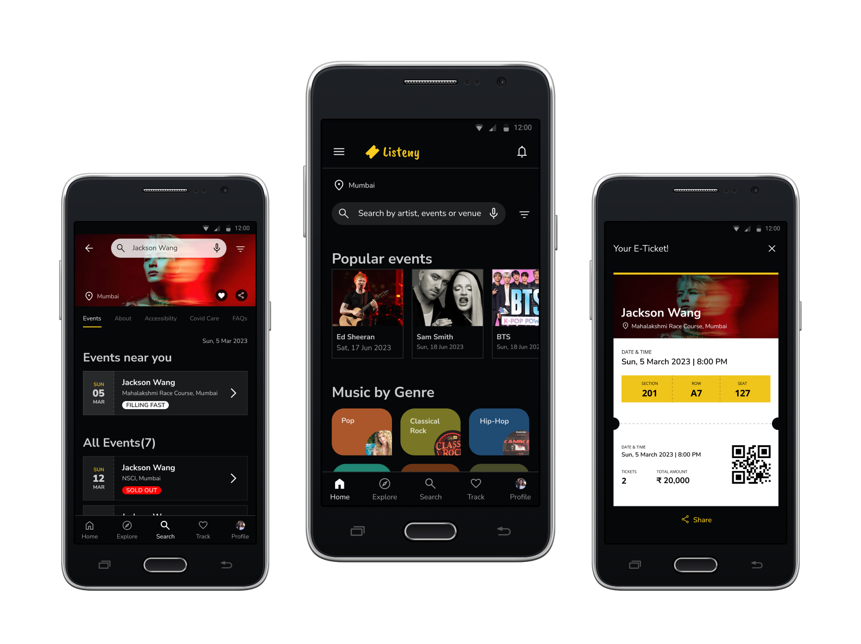
Key Mockups
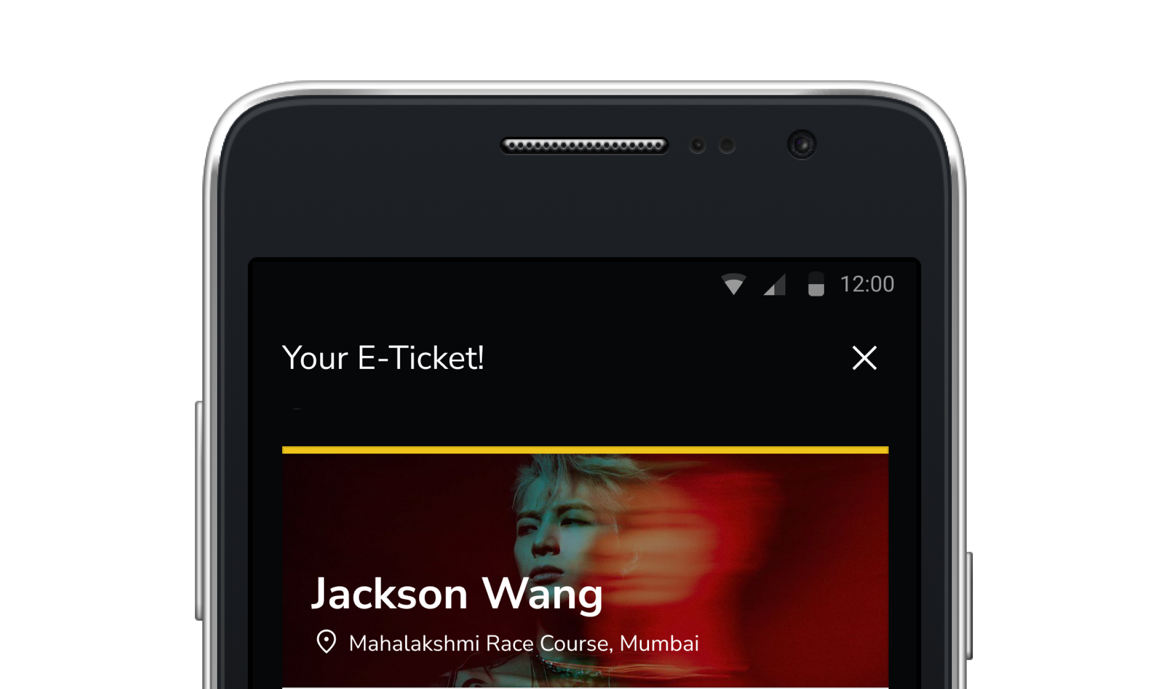
2/3 High-fidelity prototype
The final high-fidelity prototype presented cleaner user flows for building a concert ticketing app and booking. It also keeps the user needs to pay within the app or to choose preferred seats.
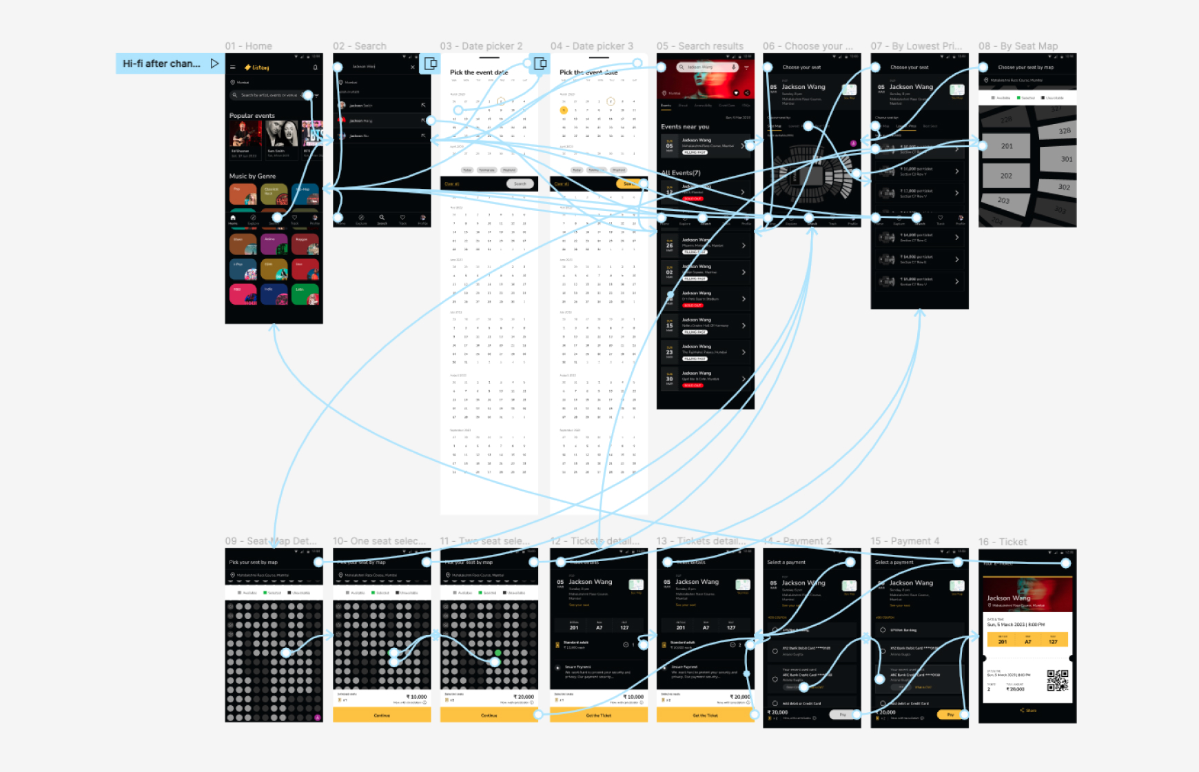
Here is the high-fidelity prototype:
3/3 Accessibility considerations
1. Provided search by voice to users who are vision impaired. Also added wheelchaired seating position for differently abled users.
2. Used icons to help make navigation easier. Also made sure the colours are accessible.
3. Used detailed imagery for musician and genres to help all users better understand the designs.
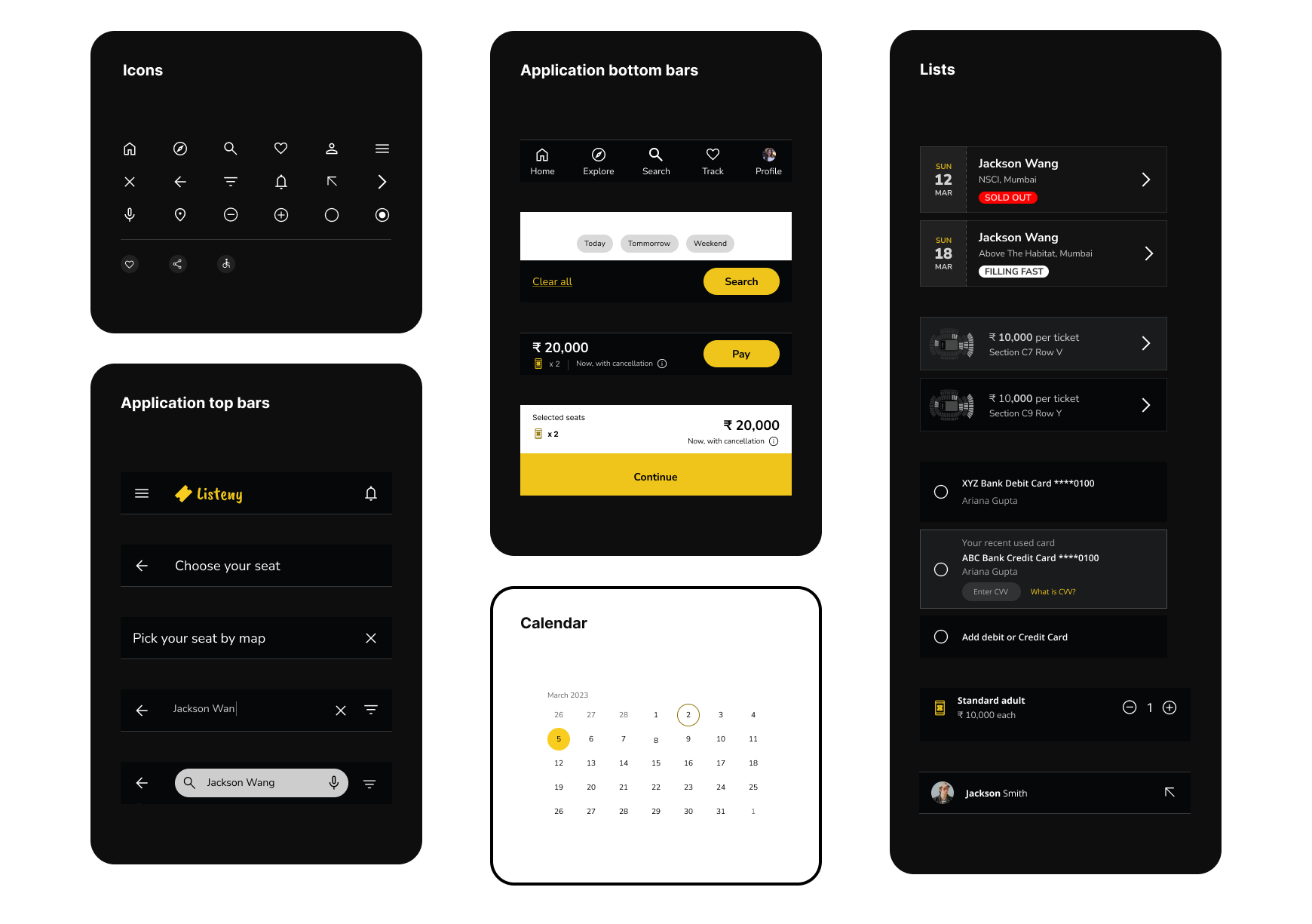
Design System
I created one scalable design system for this app. I have added more elements and components in the design system. Reusable systems of styles and components, storing them in Library.
Takeaways
Impact?
The app makes users feel like Listeny’s Concert Ticketing easy to book the ticket without third party.
One quote from peer feedback:
“This is a fantastic app! Very clean, professional, and the functionality is fantastic. You apply all of the Gestalt principles throughout. Your use of emphasis and space is excellent, especially with the side-scrolling artists on the front page.”
What I learned?
While designing the Listeny’s Concert Ticketing app, I learned how to come up with insights from the research or from the usability studies or from peer feedbacks. I also learned how to keep on iterating keeping the main goal in mind. And another one is I learned to keep in mind while designing the accessibility of colours or typography.
Next steps?
Conduct another round of usability studies to validate whether the pain points users experienced have been effectively addressed.
Conduct more user research to determine any new areas of need.
Also test the user interface design to make it easy for the user to reach thier desired goals.
Selected Works